About 136 million Americans need to monitor their blood sugar
Most glucose monitoring applications don’t help you understand what’s happening with your body.
Client: Passion project | Tools: Figma | Year: 2025
Situation
Backstory
Most women that get pregnant have to take a test to determine if that silly placenta is messing with how insulin is handled in her body. My wife did not pass, which I suppose is my fault since the placenta is something like 90% male DNA, sorry hun…
From there on, we were on a journey to keep her blood sugar levels in check. Multiple monitors, multiple continuous monitors with applications and finger pricks helped us see the numbers (with varying accuracy), but never helped address the issues.
p.s.: Our situation was centered around gestational diabetes. There are just miilllllions of people that have type one or two diabetes also.
The details
I had been itching to work on something for myself that I was passionate about, and get a little AI into my portfolio, and around that same time, I had an interview that asked for a sample project.
Task
The brief was much longer, but the gist was:
Nothing to do with their company
Use AI in an intelligent and meaningful way
Spend only 4 hours
My goals were to pick something that:
Was a genuine need in the world
I was passionate about
I would be happy to keep noodling with down the line.
With that in mind, I hopped into Figjam to plan.
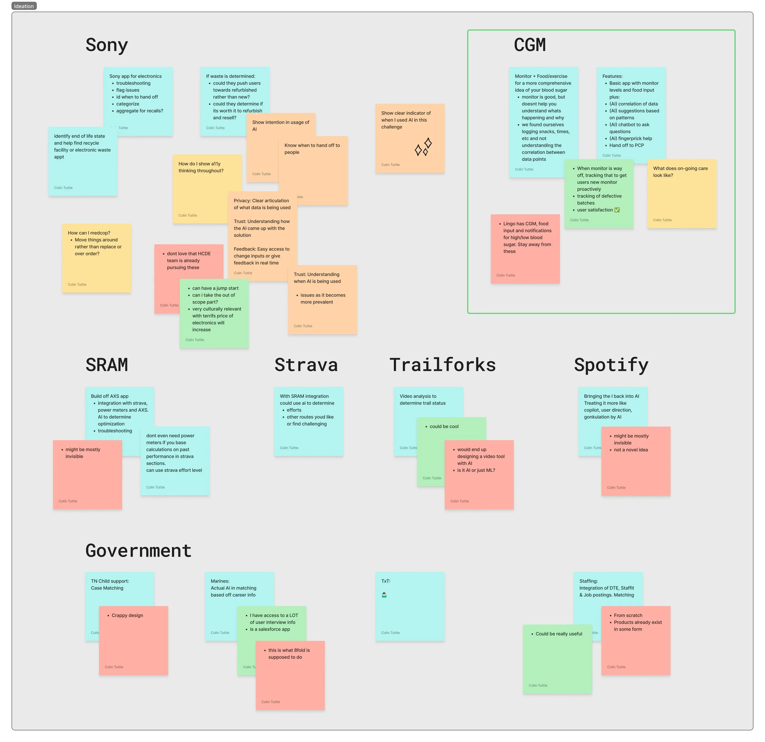
The first large step was to decide on the subject matter. While I had big feelings about my Sony headphones app, several biking apps and some of the government projects I’d worked on, those were all being tackled by 100 different companies. Plus, no one needs to see another shitty UI rework of Spotify on dribble, so I went with something that had personal meaning to me.
Action
Wow wow wow…wow
I wanted to be honest about the four hours, I knew not all the other applicants would be, but it was important to me. Knowing what can and can’t be done in that time frame is one of my skills. So with a bit of planning, I worked out how to be honest and come up with something great…some call it scoping.
Once the plan was laid out, the timer started and my cortisol levels rose.


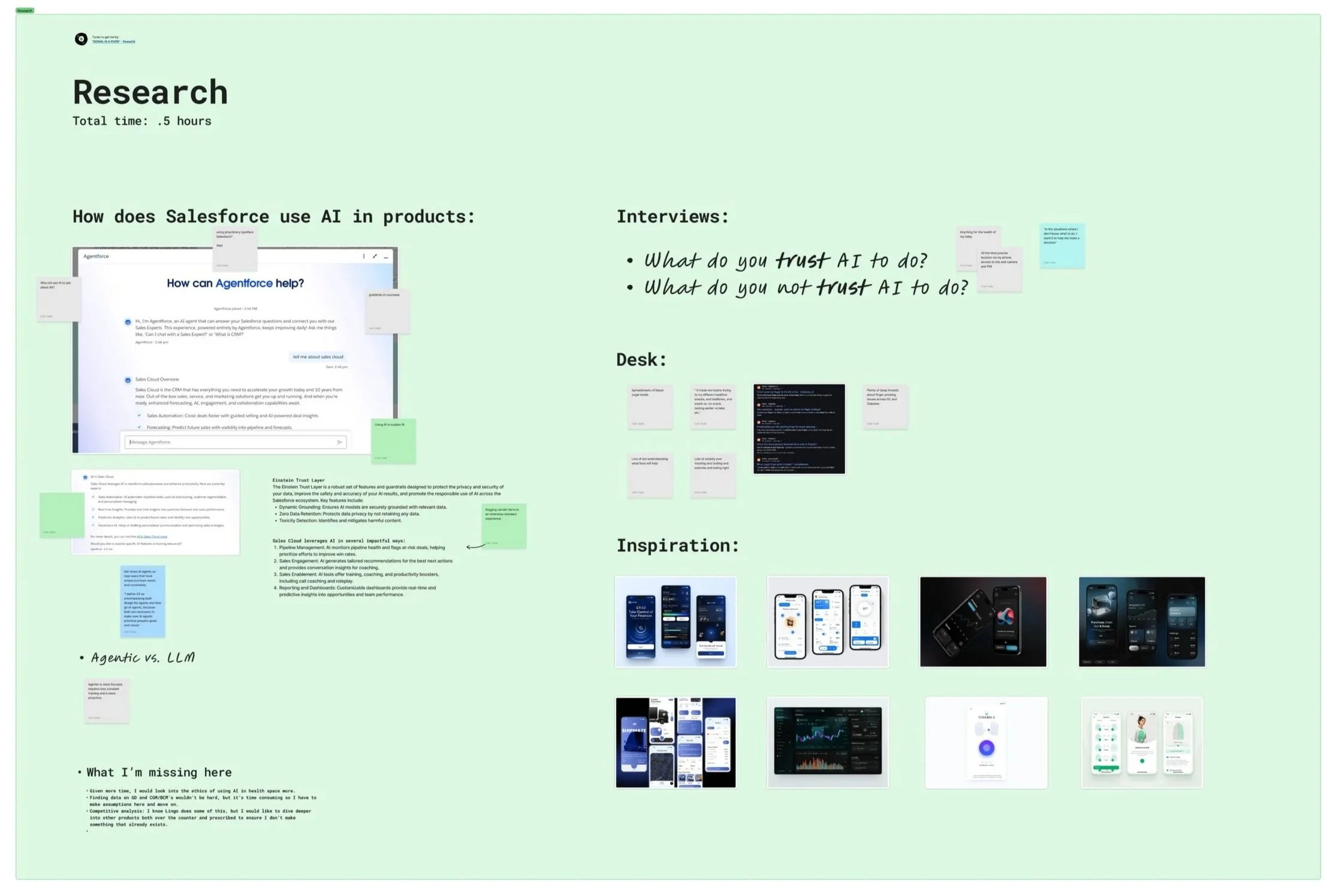
Phase 1: Research
30 minutes
I wanted to spend time looking at how to approach this intelligently before I jumped in. First, some research on how the company treated AI in their products. Luckily, thier model will tell you all about where and how they use AI.
With that understanding, I wanted to see what my user base (my wife) would and wouldn’t trust AI to do when it came to a health application. Being that this was a pregnancy-based blood sugar issue, it all boiled down to the sentiment “I would do anything for the health of my baby.” So while any use of AI was on the table, I wanted to approach cautiously and only use where it was needed, both for ethical and environmental reasons.
Finally I did a bit more desktop research on how other people track blood sugar. I found that other people tend to all use multiple methods/locations and no one application has everything they need. On top of that, while they seem to understand where they’re at health-wise, there was confusion on how they got there and what to do to help.
Phase 2: Design
3 hours
Low-fidelity sketches
I gave myself three hours for design, so I spent the first hour in lo-fi getting my ideas together. The sketches were pushed closer to mid-fi so I would spend less time in hi-fi getting the details down.
The first page laid out all the screens I would need for the main flow, plus started defining where I would use AI to help users gain a deeper understanding of both what was happening to their bodies and how to change these patterns.


AI integration
While sketching, I spent time to outline how the AI would interact with the users. Initially, I decided on four main uses:
Chatbot - Everyone and their grandma has a stupid chatbot that everyone…however, I found a lot of people asking additional questions online about how diet can affect blood sugar. To help with initial stages of their research without leaving the app, the chatbot seemed like a good idea.
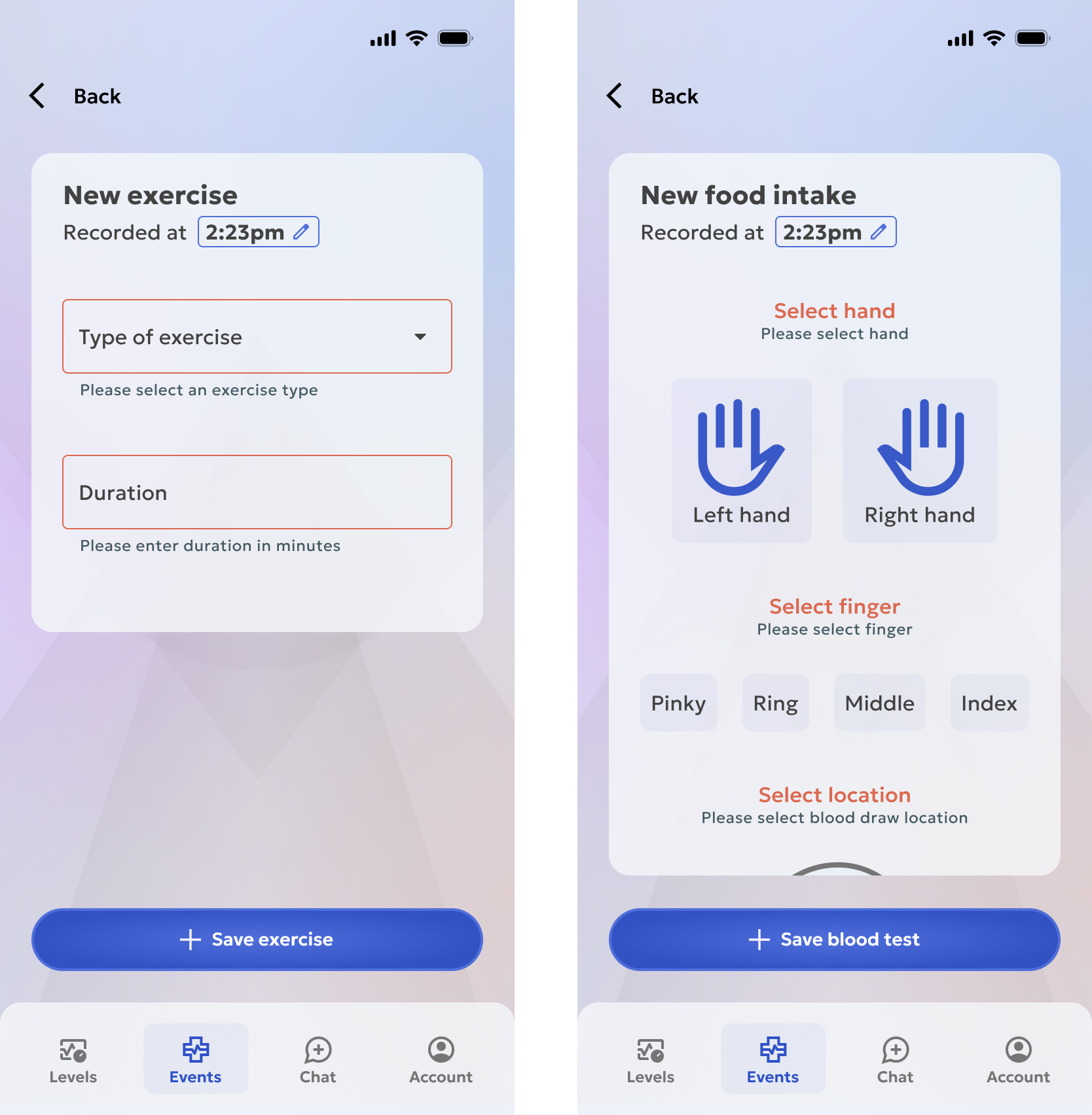
Food suggestions - One of the big questions I found again and again was what to eat when to keep your blood sugar levels more steady. Using data from blood tests and food intake, the system could determine what works best for you and make suggestions.
Exercise detection - No one likes logging shit manually. Using location data & gyroscope movement, the AI could determine what is exercise movement vs. car travel or other and prompt users to add it with one touch.
Finger prick location - Theres no worse feeling than using a lancet to prick your finger, but not have enough blood for an accurate reading. Using AI to look for patterns in logged blood tests for which fingers give acceptable amounts of blood, then give suggestions that rotate between fingers will help reduce re-tests and sore fingers from over-testing.

The next sketches laid out the main features for each page to lighten the hi-fi design phase.
Sensitivities
One theme that came up many times in research was that there is a lot of stigma and sensitive subjects around gestational diabetes that need to be considered and treated with care. A mothers care for her baby is her number one concern, so when her blood sugar can put that at risk, feelings of shame creep in. The internet is no help, with all the stigma around diabetes and people critiquing what mothers are eating. Coupled with any history of eating disorders and navigating this can be a nightmare.
When designing the application, I aired on the side of caution when asking for certain data points. At the end of the day, if the application doesn’t need to know details that may be triggering, I can’t in good conscience ask for it. I’d rather the application open a door to help people step through at their pace.
High-fidelity design set up
Knowing the timeline, I didnt have the luxury of brand exploration to find the right style. Instead I opted to use elements from a DS that I’m working on for a client. The upside is that I have high quality component systems made by me. The downside is the app just looks like some tech app, not a comforting experience it needs to be.
The colors were the same, pulled a system from that same project. Initially I had grand designs about using the three level of the the color system (primitives, alias & semantics), however the copy/paste into a new file wiped out the names and links, so I stuck with two levels for the first pass of the design. This way I could define my primitives and assign them at a semi-semantic level at least.

Version 1 design
I spent the next hour and a half noodling with the components and colors to come up with a good looking home page that the rest of the app could follow. From there, the comps came pretty quick and my design time wrapped with 11 screens designed and prototyped.
Phase 3: Validation
30 minutes
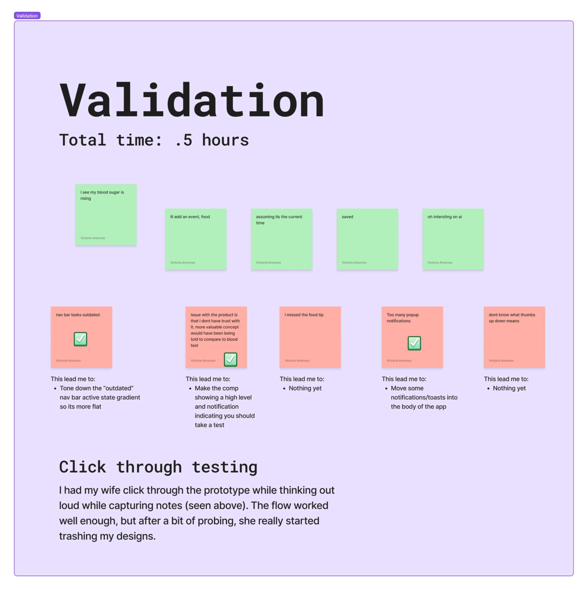
So what’dya think?
I planned for 30 minutes of validation and edits to wrap the timed section, so I pulled my wife back in for some click through testing on the fly. The initial feedback was good, all the primary interactions were triggered and no major issues. With a bit more probing, she really started ripping it to shreds.
This lead to three main fixes (with only 15 minutes to design them):
Make the nav bar look more better
Add nudges for users to validate blood sugar levels with a manual test to help users trust the app more
Adjust how shelves, toasts and other notifications are handled to reduce cognitive load
⏲️ TIMER STOPS HERE
I sure wish I had more time…
From the start, I knew 4 hours wouldn’t result in anything near what I wanted, so I planned an additional 1.5 hours of stretch goals time. I prepared my presentation to cover the 4 hours, and if they wanted to see more they could. So you get the same option. If you want to see just what I do within that time, read no farther. Seriously, get outta here…
Phase 4: Stretch goals
1.5 hours
Ok, so now that the fun-haters are gone
With my final stretch of design time, I expanding the app to add in the other two main flows for adding an event. This was what brought the app to MVP status in my eyes. Now all the pieces of data could be tracked in one place and users would understand what it meant.
Result
To be continued
As you could guess by my resume, I did not get the job, so real results here just yet. HOWEVER, if you’d like to play with the Figma Make version of the blood test screen, I had some fun making that.
Reflections
On to the next version!
This was always a project for me, so when I wrapped the interview, I keep a list of changes for my paternity leave…because everyone has oodles of time with a newborn!
Version 4 plans
I had to cut a few items to stay on time:
Chatbot - This got cut for time…we’ve all seen a chatbot before. Maybe in the future I’ll come back to it.
Finger prick AI integration - I started playing with this a bit more in V4
Branding and color work for more appropriate look and feel - This ended up being my primary focus for V4
Post (baby) launch enhancements
Let’s fix some stuff
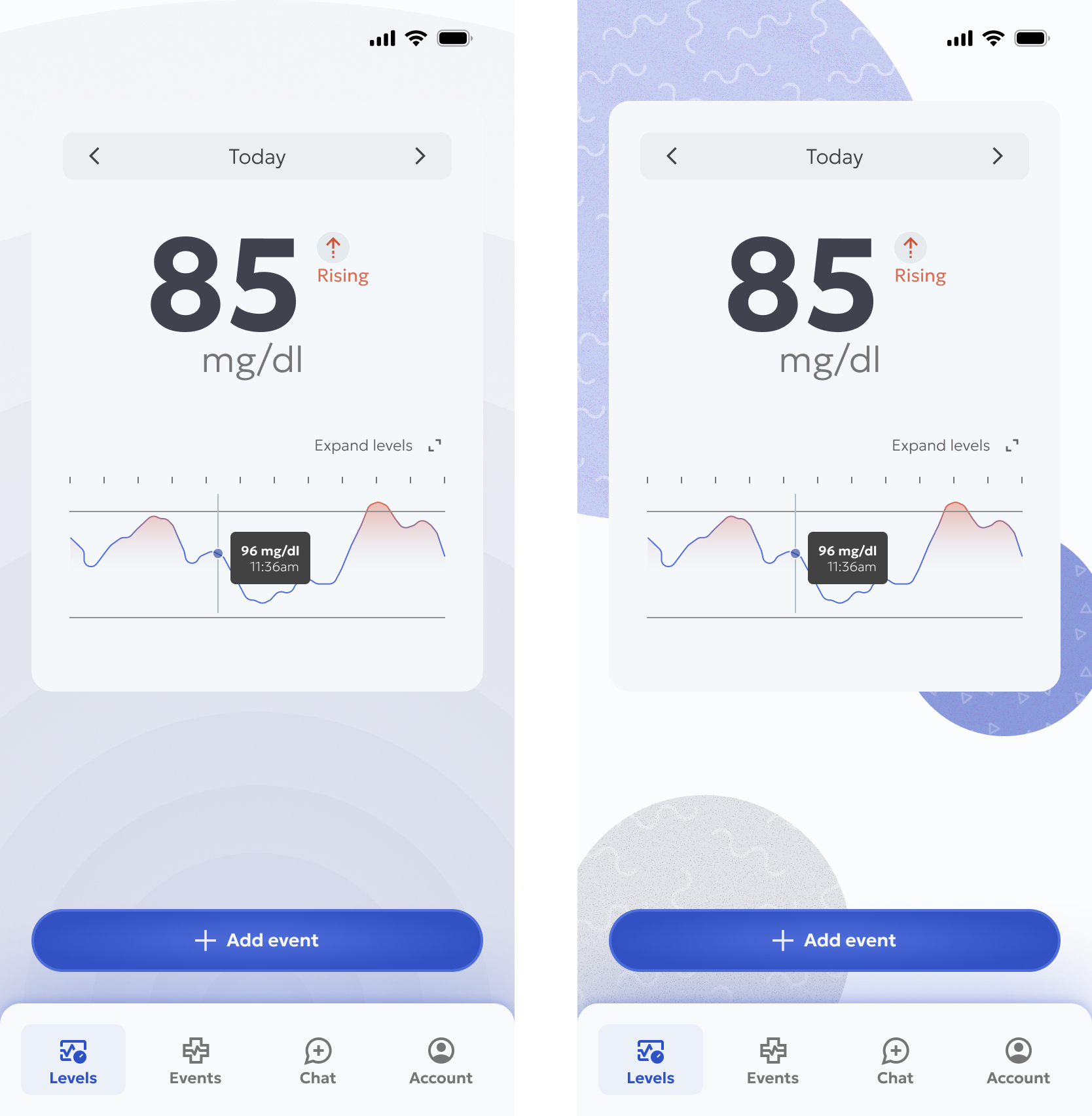
The first thing I wanted to address was the branding. I come from a graphic design background, so it hurt my heart to have a style that just did not match the subject matter. I took a step back from the dark mode to lighten the feel and started using blues to give it a calming feel.
I spent time making the navigation bar feel more modern and making the primary action button ambidextrous while I was at it.
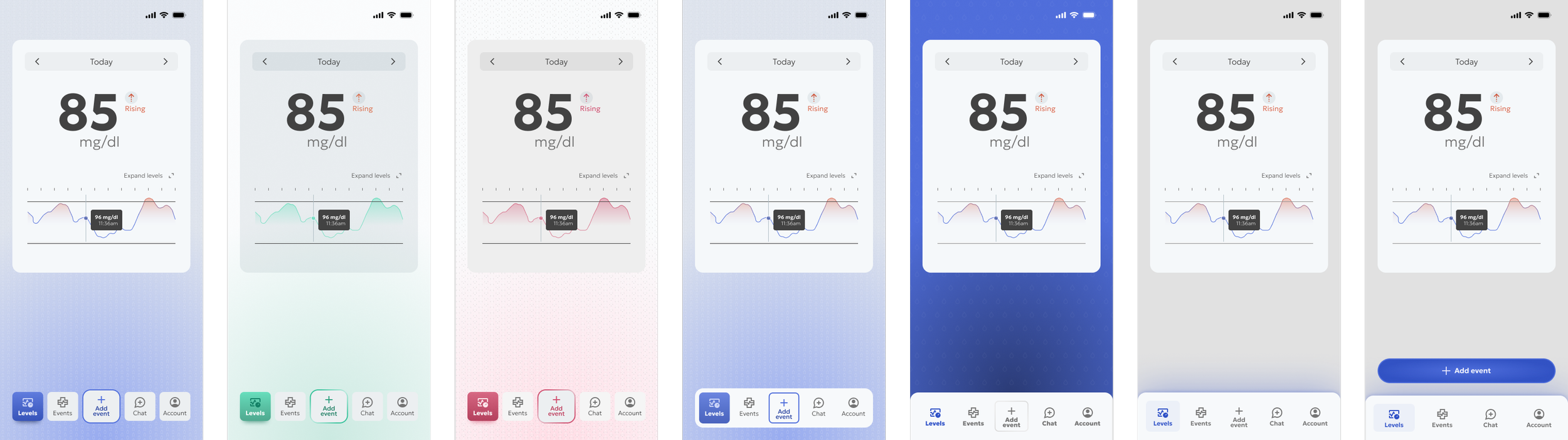
The gray and blue felt right for a medical application, but it was a bit boring, so I spent some time playing with different patterns and illustrations.

It still felt very ‘blah’ to me, which could be fine, but I wanted something more visually interesting. We’ve been having these beautiful wildfire sunsets, so I played with a dusty orange and green palette for a bit.
I quite liked the dark green version, but again, just didn’t fit the subject matter well.

The blue was a good primary color from an accessibility perspective, plus is synonymous with the medical field, so I played with soft accent colors and give a calming background and settled on this treatment.
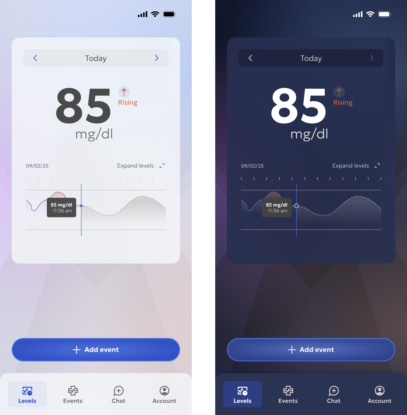
Once the final design style was in place, I could get to work on all the little bits I wanted to update. On the primary landing page, ‘Levels’, I cleaned up the UI a bit and worked on making the line graoh make sense. Prevously, I just whipped up a full chart, but if its showing a full day, it would need to not be full. To make this feature more useful, I added a predictive element to the remainder of the day, so users know what to expect based on past levels.

Before
After
I also spent time adding error states when users don’t add content before saving records. Much to my surprise, when I started typing the input errors in Figma, the text autofilled. New AI features? Very cool stuff either way.
What’s next?
V5 coming up
Being a passion project, there’s no real end for this app, so I plan on playing more.
The main areas I feel still need work are:
The treatment of popups, specifically any AI features. I currently have a badge indicating an AI insight, with paths to understand how that insight was found and give feedback, but I’d like to test those to see if they instill trust.
Cards are not all treated the same way stylistically, especially with overflow. I want to get that nailed down.
The two navigation items that weren’t made were the chat and account. I do have the start of a dark mode, which would be changed in settings, so that would be a fun page to create. AI settings would live in there as well and will be its own beast.
Additional states for each of the pages just to add a bit more life to it.
Stay tuned for the Claude MCP updates!